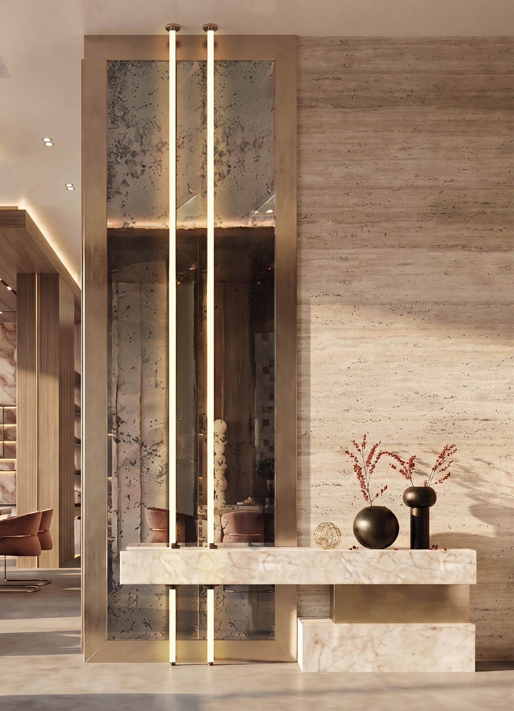
Colors influence emotions long before people notice furniture, artwork, or decorative details. A soft blue room may encourage calm, while a bright yellow accent adds energy to a quiet corner. Professional interior design uses colour psychology to connect visual character with human behaviour, helping homes, offices, and commercial spaces support the mood each setting deserves.
How colours influence emotions
Every colour carries emotional associations shaped by culture, personal memories, and surroundings. Blue commonly suggests calm and stability, while green connects with nature and balance. Red adds intensity and excitement, whereas purple may suggest creativity or luxury. Designers consider the purpose of each room before selecting shades, since colour affects how occupants respond to their surroundings.
Warm colours encourage energy
Red, orange, and yellow add warmth and visual activity. Restaurants may use warm accents to create lively dining areas, while offices introduce small touches to support an energetic atmosphere. Large areas of intense colour may overwhelm occupants, so designers balance bold shades with neutral walls, natural materials, and softer decorative elements.
Cool colours support calm environments
Blue, green, and muted violet suit spaces associated with rest, focus, and reflection. Bedrooms benefit from gentle blue tones, while green works well in reading areas and wellness rooms. Cool shades also give compact rooms a spacious appearance. Designers adjust saturation and brightness to prevent a room from looking cold or uninviting.
Neutrals provide visual balance
White, beige, grey, and earthy tones offer a flexible foundation across different interior styles. Neutral palettes allow furniture, artwork, and architectural details to attract attention without visual clutter. Designers also combine warm and cool neutrals to prevent flat appearances. Natural timber, stone, and textured fabrics add depth while maintaining a calm overall setting.
Color choices reflect brand identity
Commercial interiors use colour to communicate business values and influence customer impressions. A healthcare clinic may select gentle greens and blues to suggest reassurance, while a creative studio may feature expressive accents. Consistent colour use across reception areas, meeting rooms, and shared spaces helps visitors recognise the brand and connect its visual identity with its services.
Lighting changes colour perception
A paint sample may appear different under daylight, warm bulbs, or cool LEDs. Designers examine samples at different times and test them beside flooring, furniture, and wall finishes. Such checks prevent unwanted contrasts and support a coherent palette. Thoughtful colour selection gives every interior a distinct personality while supporting comfort, function, and visual harmony.
